Pornichet, the Destination
The Pornichet brand identity, a project led by the Graphéine team since October 2024: a three-syllable logo, a modernized crest inherited from 1912, a custom typeface and a full deployment system. This page focuses on my personal contribution within the team (3D graphic execution, simulation, visual rendering and motion design): the design of the logo, crest and typeface remains the collective work of the Graphéine team.
Full-length motion
The motion piece bringing together all the work done on this project.
Logo & Crest
The logo splits "Pornichet" into three syllables, each tied to a time of day and a place in the area. The crest, inherited from a 1912 drawing, was modernized while keeping its dolphins, its Pierre-Percée rock and its maritime pines.
Landscape motion: an artistic concept that explains the logo through a sunset over the bay.
Engraving & texture
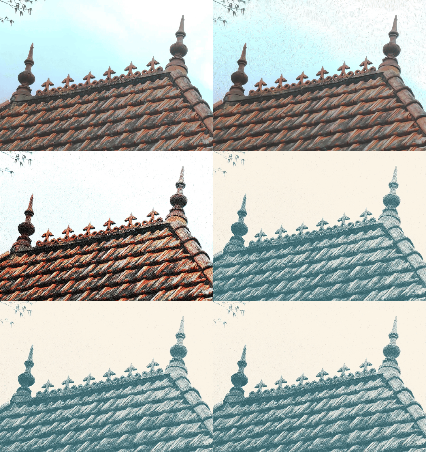
The mood visuals are built in 4 steps: raw photo, oil filter, conversion into an engraved halftone, then a color LUT specific to the Pornichet identity.
Typeface: La Pornichétine
A custom typeface inspired by Art Nouveau and the Belle Époque, with curved shapes evoking vegetation, wind and the flight of seagulls. Its animation was built procedurally in Cavalry.
3D: the logo in the city
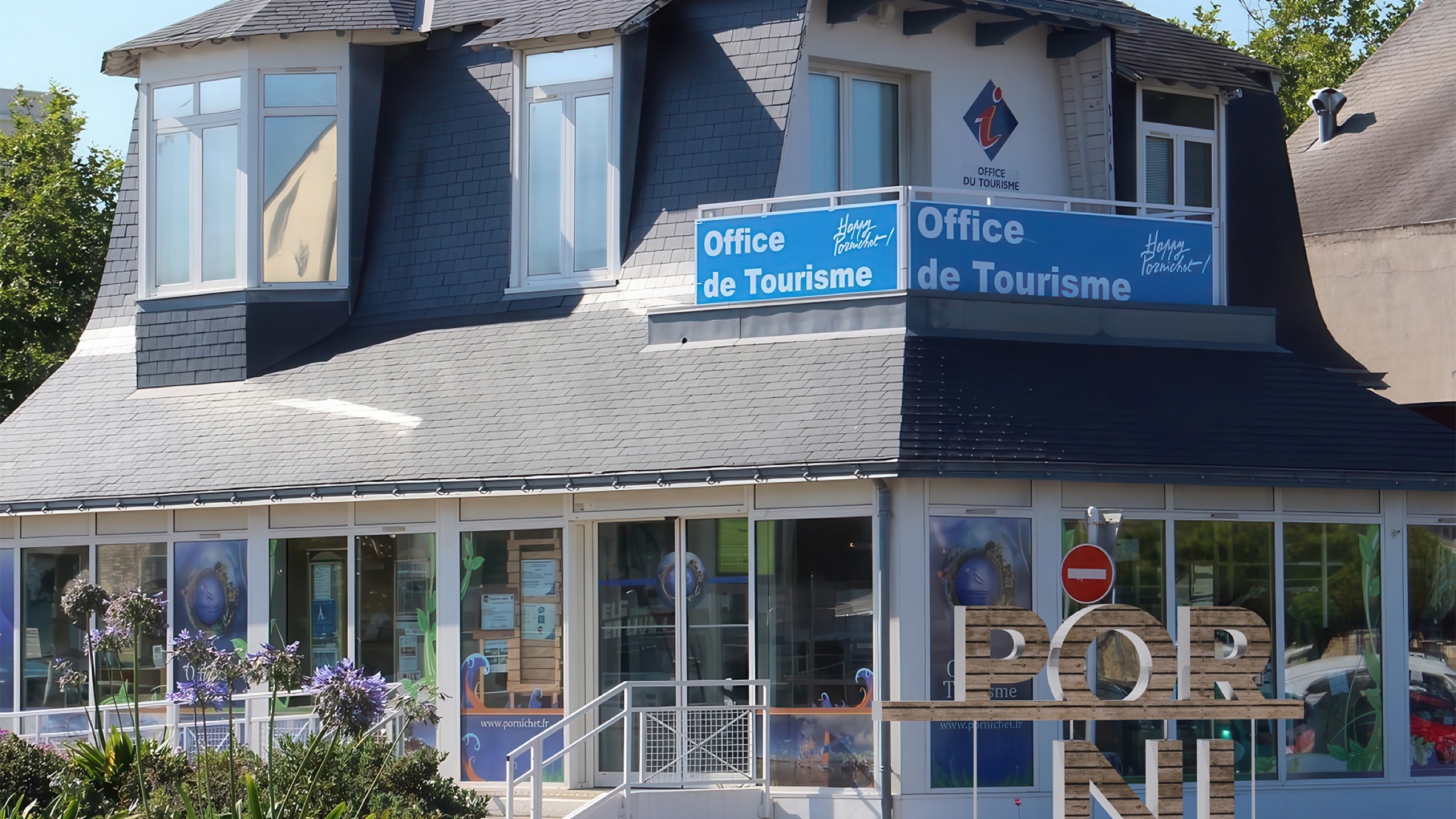
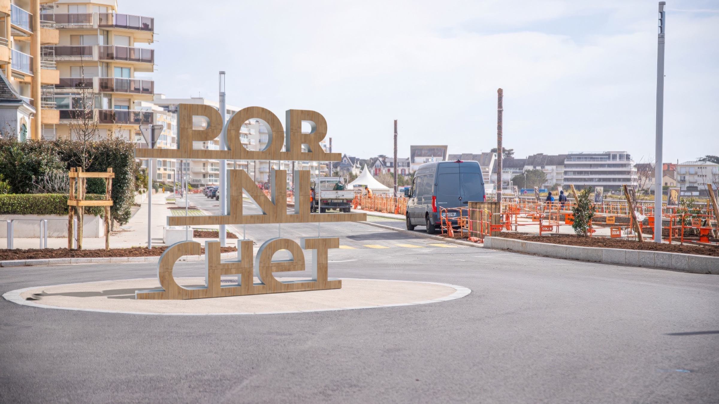
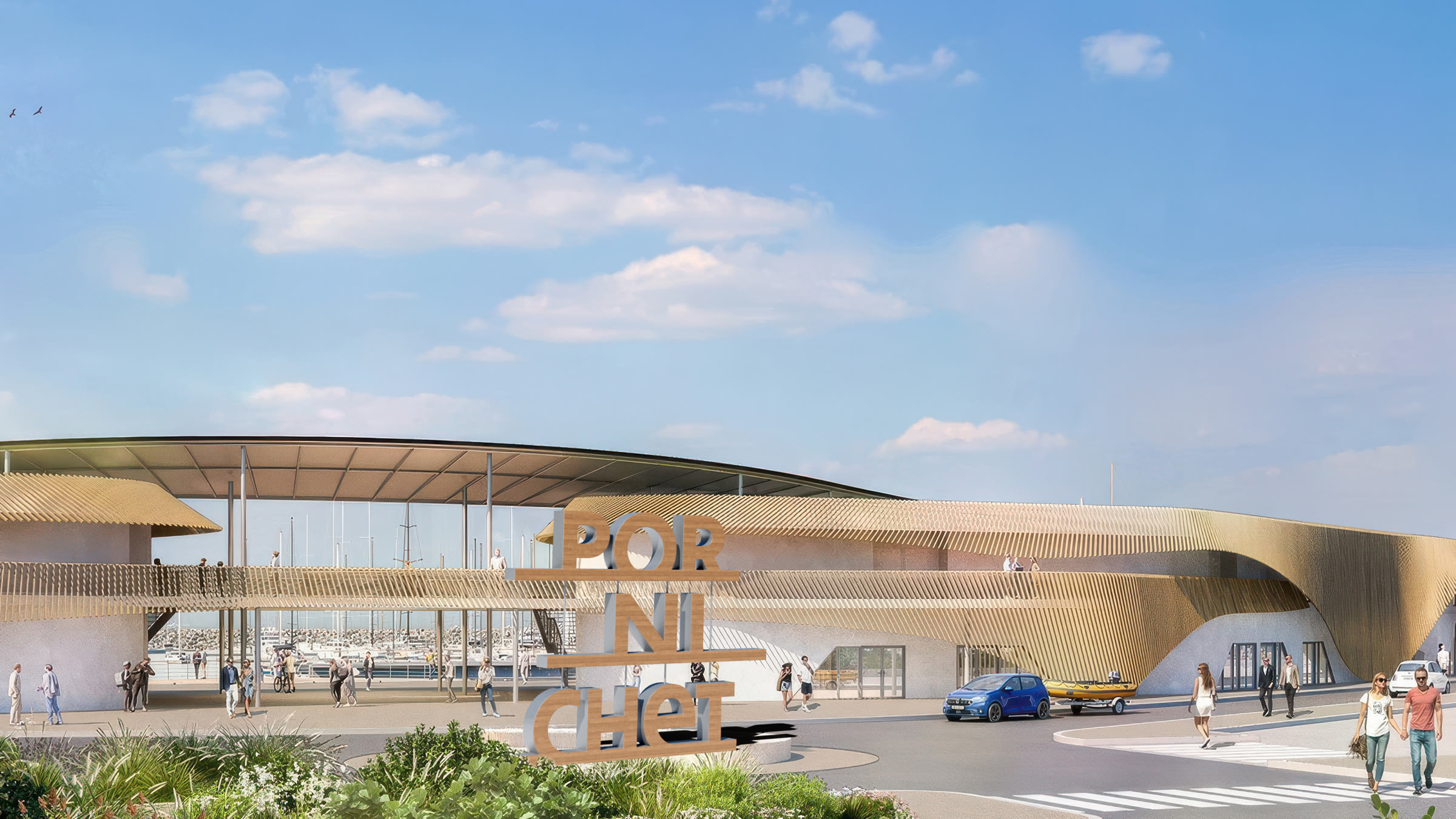
Simulating the logo's rollout in urban settings (tourist office, roundabout, terraces, beach) to visualize the identity before its real-world installation.
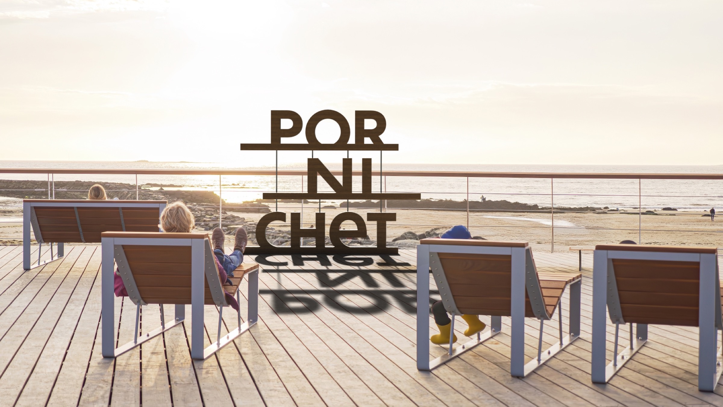
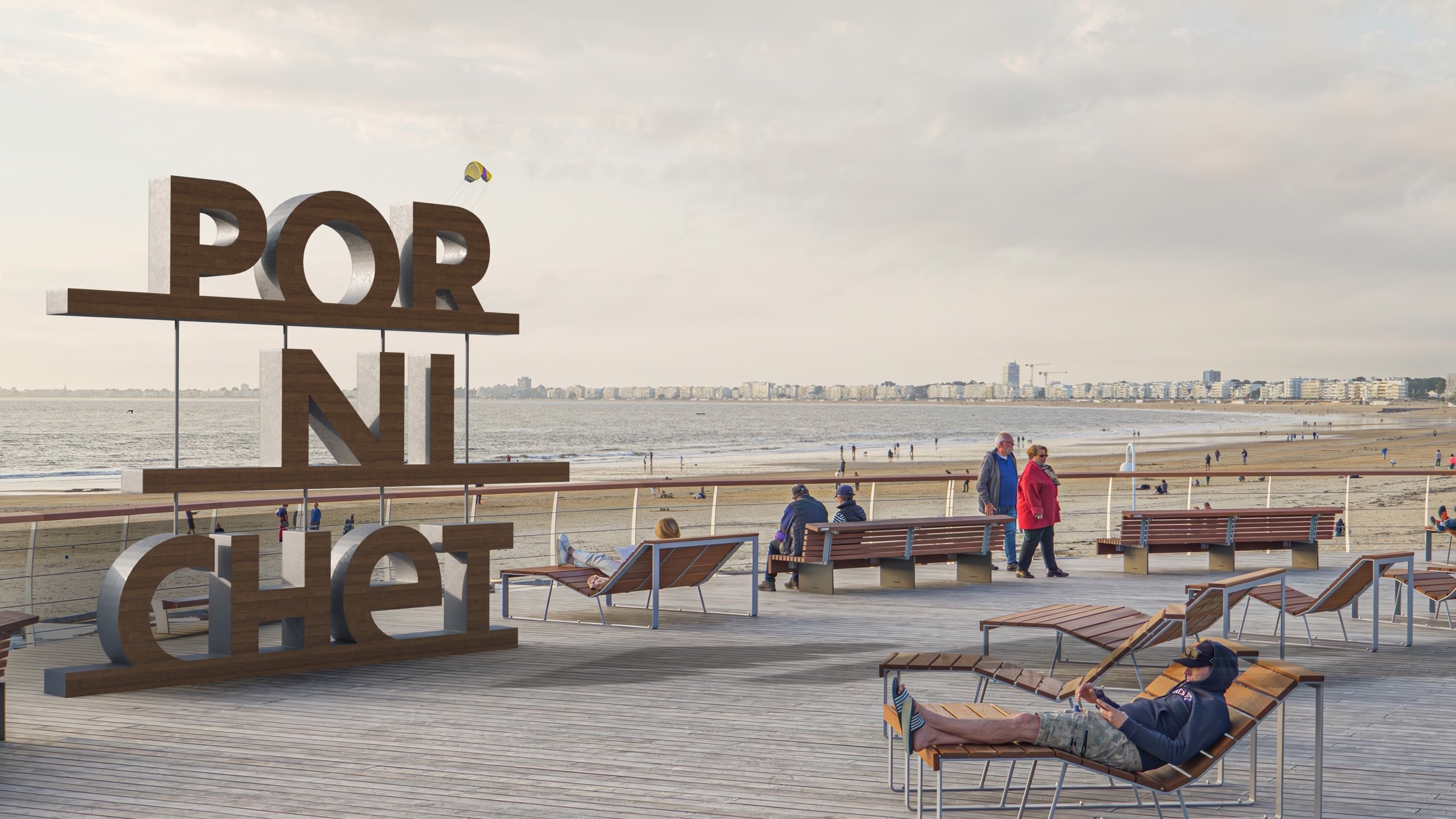
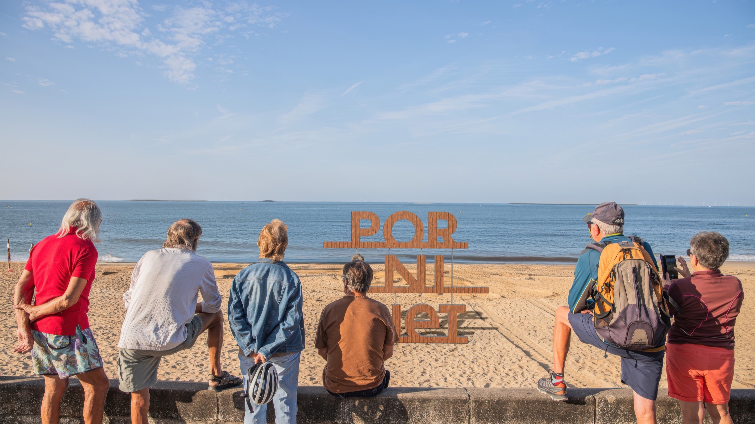
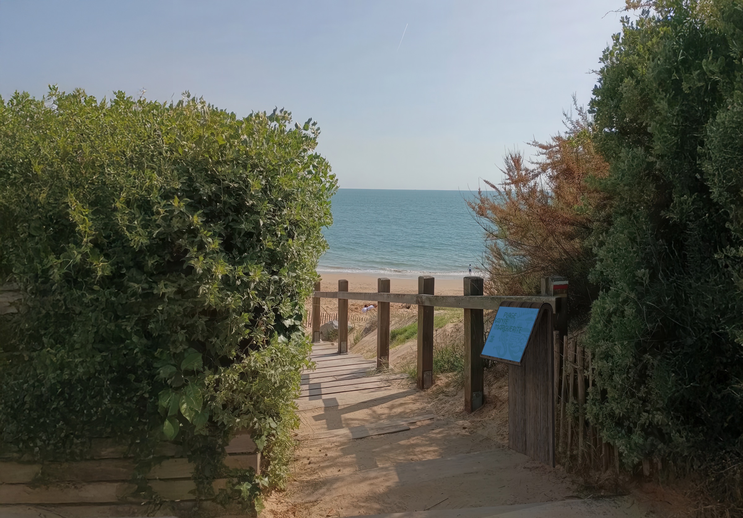
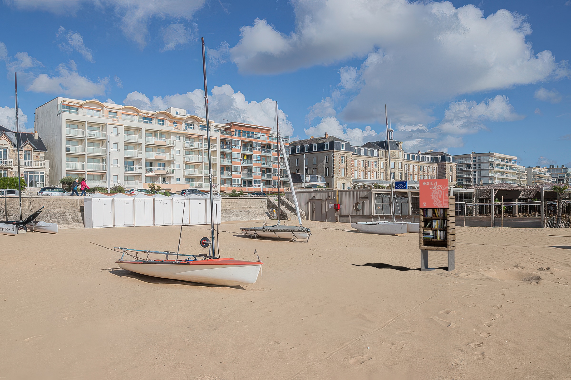
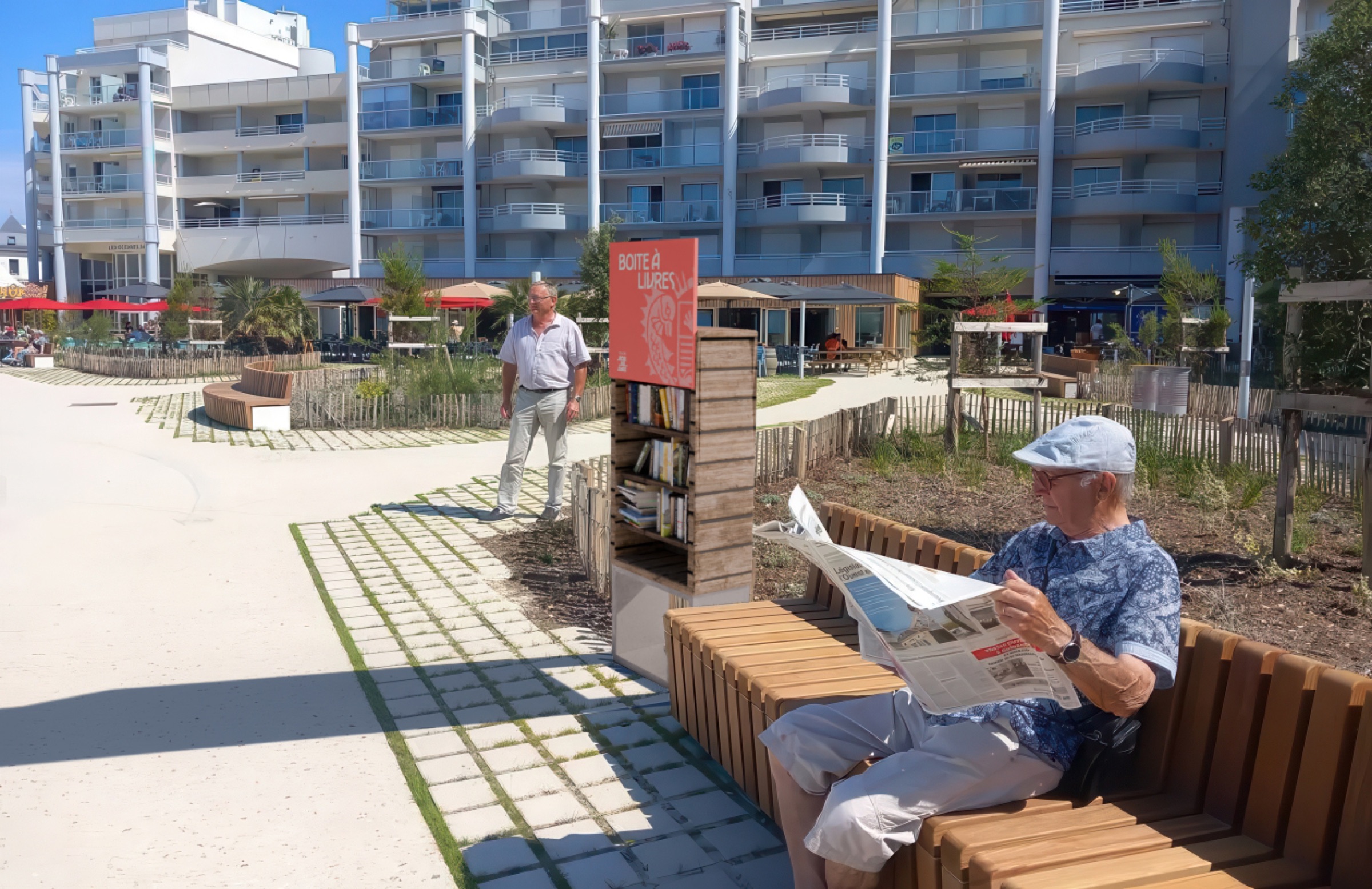
A concept for naming the beaches and for little free libraries, designed to extend the identity into street furniture.
3D: brand book in context
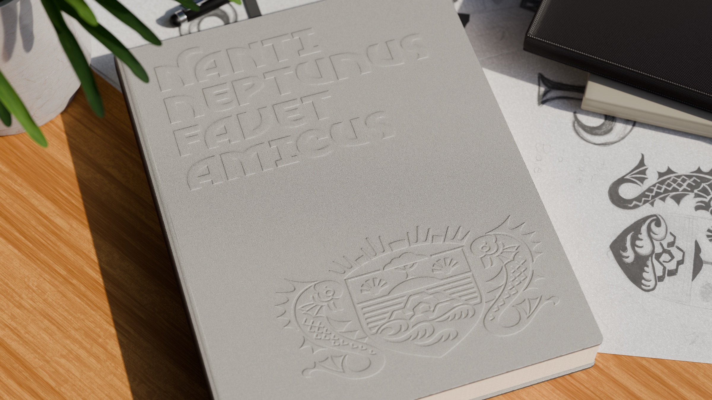
3D simulation of the brand book, with the crest embossed in relief on the cover, giving the identity physical presence before it goes to print.
Next project